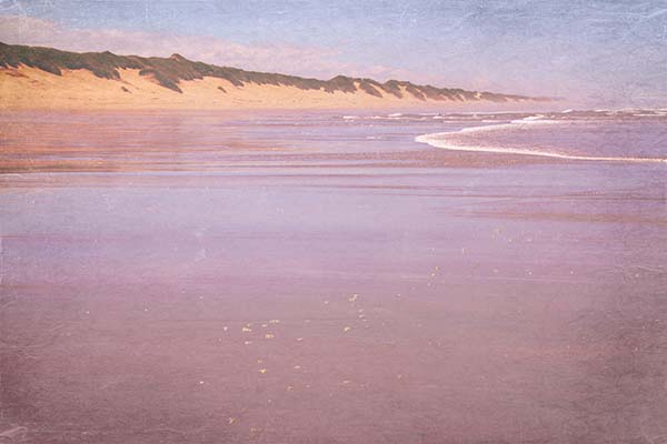
During our trip up the West Coast, we camped in the Oregon Dunes and spent one day at the beach where I took this photo. To kick it up a notch, I edited it in Photoshop Elements and played around with textures. I ended up with three different photo by changing the blending mode of just one added texture.
In the top picture I wanted to achieve a pink after-sunset mood:
"Polaroid-7-vintage rose" by Shadowhouse Creations, Overlay at 70%
Levels adjustment
"Dustyrose" by Kim Klassen, Saturation at 50%.
Then I played some more and came up with a completely different effect:
"Polaroid-7-vintage rose" by Shadowhouse Creations, Overlay at 70%
Levels adjustment
"Dustyrose" by Kim Klassen, Luminosity at 50%
After that I created a more wintery scene that reminds me of glaciers and a really cold bay:
"Polaroid-7-vintage rose" by Shadowhouse Creations, Overlay at 70%
Levels adjustment
"Dustyrose" by Kim Klassen, Exclusion 100%
No big changes in the "processing", but quite some different outcome.
Here's the original, rather boring photo, straight out of the camera:
Which one is your favorite?
.


10 comments:
great examples of what blending modes can do
I love the wintery one but the 1st is my favourite
I actually like the peace of the original, but then I'm attracted to #3 it's been turned into something other, the dunes become a string of low cloud or a giant wave - wonderful.
Sue x
I like all of them, but the first one is my favorite. Lovely photo, Carola! :)
I think the first one is my favorite. I was raised in OR and for years my family had a cabin right outside Yachats on some dunes just like this.
Memories!
Darla
I love them all but I think the first one is my favorite too. I hope you had a good trip Carola!
Oh my gosh...these are just beautiful. I don't think I can pick out one because I like them all. They remind of Monet's paintings of the Rouen Catherdral in different light.
I love them all, but the first is definitely my favourite
I really enjoy all the work you did and how the mood of the photograph changed each time. I'd have to say the third one is my favourite, it looks like a painting I'd like to have :-)
What a fun series --a mini-tutorial on post processing. I also like the second one the best!
Hey Carola, how grand to see these images! I tend to like pink tones with the sea scapes so I pick #1.
Thanks for sharing!
Post a Comment